Like a doctor who in casual conversation describes an aching arm as lateral epicondylitis as opposed to tennis elbow, we fashion industry folks like to throw around the Pantone colors like they are part of universal vernacular. So who is Pantone, and why do they get to decide the colors for the rest of the world? By their own definition, Pantone is “the world-renowned authority on color and provider of systems and technology for the selection and accurate communication of color across a variety of industries.”
1. Aurora Red
Banana Republic “Sloan” pant, $88 Eileen Fisher jacket, $378 (Belk) Alexander McQueen dress, $1,965 (Gus Mayer) Michael Kors “Marti” sandal, $125 (Belk) Mineral Fusion “Firery Lava” nail polish (Whole Foods) Maybelline “On Fire Red” lipstick (CVS)
Powerful in the world of design, their seasonal hue forecasts are key for every company who designs physical products, from fashion designers and cosmetic companies to car manufacturers and graphic designers. In fact, Pantone has a hand in the color of roughly half of all garments sold in the U.S., according to NPD, a market research group.
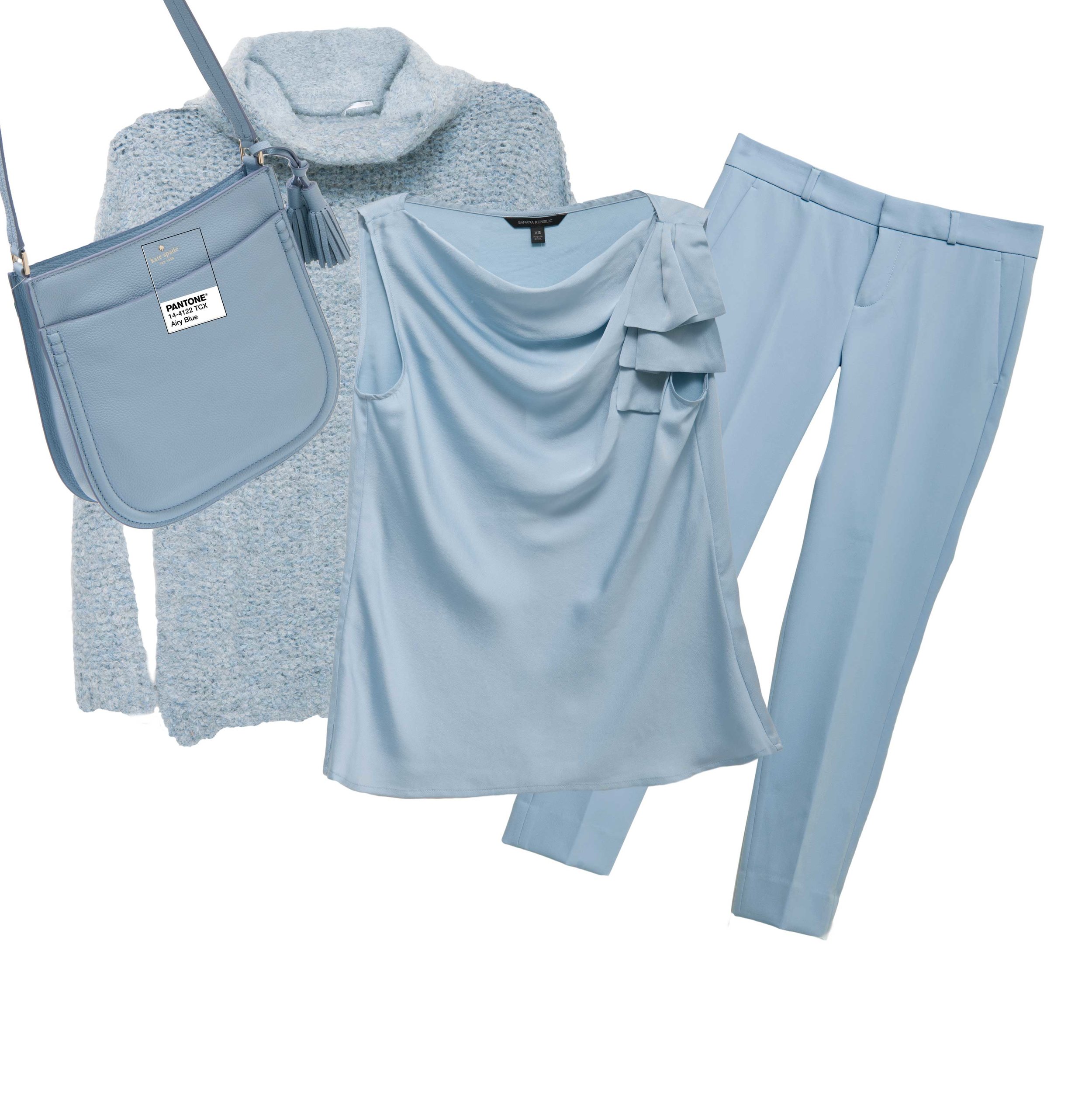
2. Airy Blue
Kate Spade “Hemsley” bag, $358 (Belk) Free People sweater, $128 (Von Maur) Banana Republic top, $68 Banana Republic “Avery” pants, $88
Pantone makes three major color announcements every year: The Color of the Year (between fall and December), Spring Fashion Report (around September), and Fall Fashion Report (around February). These color forecast announcements are purposely made well in advance so they can be used to create for the seasons in question.
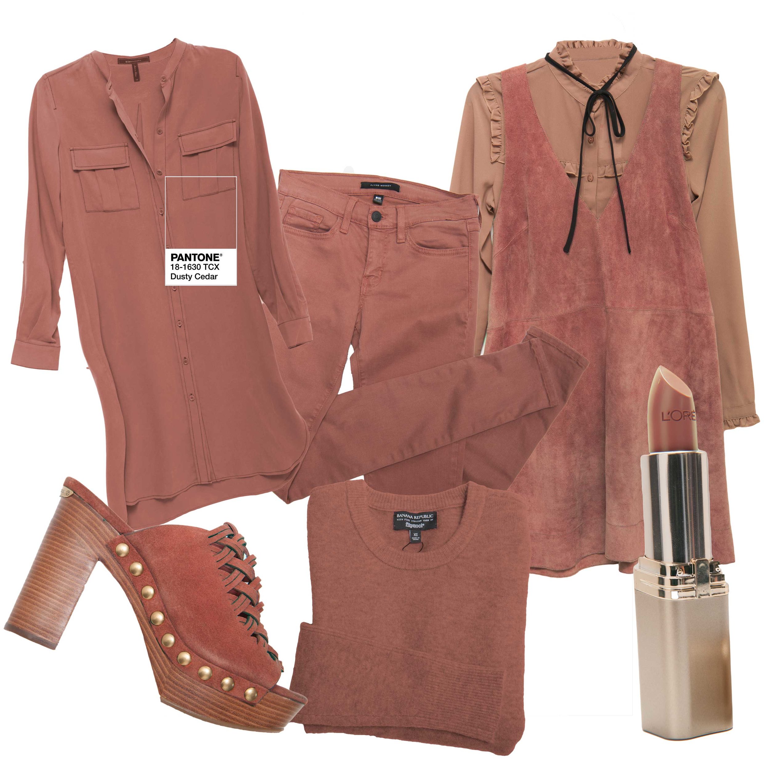
3. Dusty Cedar
BCBG shirtdress, $248 (Belk) Flying Monkey jeans, $62 (Von Maur) Free People suede jumper, $168 (Belk) Glamorous blouse, $52 (Von Maur) L’Oreal “Saucy Mauve” lipstick (CVS) Banana Republic sweater, $78 Michael Kors “Westley” mule, $165 (Belk)
How do they choose color trends? An international committee of 10 operates like a secret society, meeting twice a year in Europe at the invitation of Pantone to make selections. This diverse group of people travels the world observing average people in different countries, documenting attitudes towards life and politics, street fashion, and beauty trends. Gathering in an all-white room, these anonymous individuals each present their suggestions, and with sound reasoning and picture proof, then vote on the final colors. According to Pantone, “the purpose of the colors is not just to set a trend. There is so much psychology behind colors and color theory; the reports are meant to represent the zeitgeist of the entire world.”
4. Lush Meadow
Banana Republic blouse, $78 New Directions jewelry, $14 & $26 (Belk) Pacifica “Psychedelic Jungle” nail polish (Whole Foods) Monique Lhuillier, $595 (Gus Mayer) Banana Republic suede handbag, $158
John Crocco, creative director at Perry Ellis, says that if designers choose to follow the color forecasts, they will be a “part of what ultimately becomes the trend.” But when designers overlook or flat out ignore trends as they relate to design, they will eventually become irrelevant.
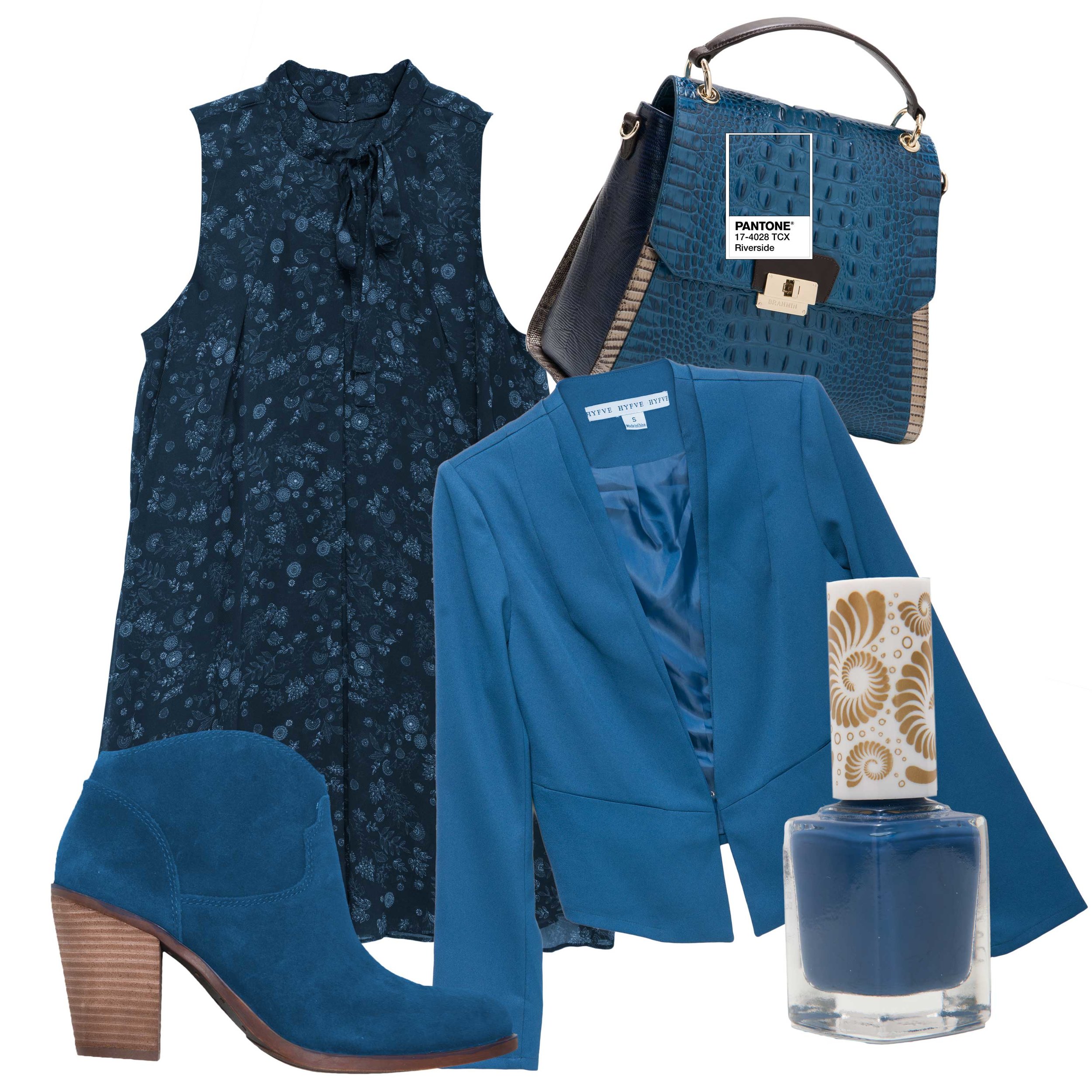
5. Riverside
BCBGeneration dress, $98 (Belk) Brahmin “Brinley” handbag, $375 (Belk) Hyfve jacket, $44 (Von Maur) Pacifica “1972 WPool Party” Nail Polish (Whole Foods) Lucky Brand “Eller” boot, $139 (Belk)
This year, Pantone describes their fall palette as “…a unity of strength, confidence, and complexity. The desire for tranquility, strength, and optimism have inspired a palette that is led by the blue family. Along with anchoring earth tones, exuberant pops of vibrant colors also appear throughout the collections. Transcending gender, these unexpectedly vivacious colors in our Fall 2016 palette act as playful but structured departures from your more typical fall shades. Blue skies represent constancy as they are always above us. Grays give a feeling of stability, Red tones invite confidence and warmth, while the hot Pinkish Purples and Spicy Mustard Yellows suggest a touch of the exotic.” A perusal of Birmingham stores makes evident Pantone’s influence, as pictured this month.
6. Spicy Mustard
Love Always sweater, $34 (Von Maur) Lulu infinity scarf, $22 (Von Maur) Lush blouse, $42 (Von Maur) OPI “I Just Can’t Cope Cabana” nail polish (CVS) Cesca shoulder bag, $38 (Von Maur) Tahari dress, $128 (Belk)
7. Warm Taupe
Karen Kane jacket, $179 (Belk) Banana Republic dress, $138 BCBGeneration “Sawyer” Boot, $159 (Belk) Cover Girl “Toasted Almond” nail polish (CVS) L’Oreal “Silverstone” lipstick (CVS) Drew silk top, $225 (Gus Mayer)
8. Potter's Clay
Sanctuary sweater, $69 (Von Maur) Helmut Lang suede shirt jacket, $995 (Gus Mayer) L’Oreal “Ginger Spice” lipstick (CVS) One the Land skirt, $36 (Von Maur) Lucky Brand “Ysabel” bootie, $129 (Belk)
9. Sharkskin
Banana Republic dress, $118 Metamorfosi pant, $415 (Gus Mayer) Stella McCartney sweater, $1,375 (Gus Mayer) Michael Kors “Keaton” slip-on sneaker, $125 (Belk) Steven hobo, $98 (Belk) *Mineral Fusion “Slate” nail polish (Whole Foods)
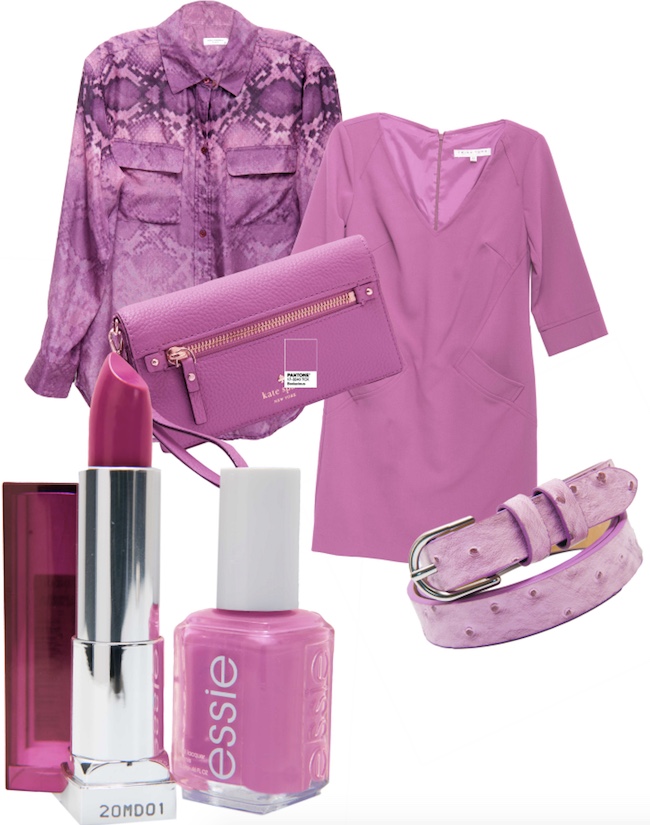
10. Bodacious
Equipment blouse, $238 (Gus Mayer) Trina Turk dress, $328 (Belk) Banana Republic belt, $38 Kate Spade wristlet, $148 (Belk) Essie “Play Date” nail polish (CVS) Maybelline “Brazen Berry” lipstick (CVS)
* As published in B-Metro Magazine, October 2016


